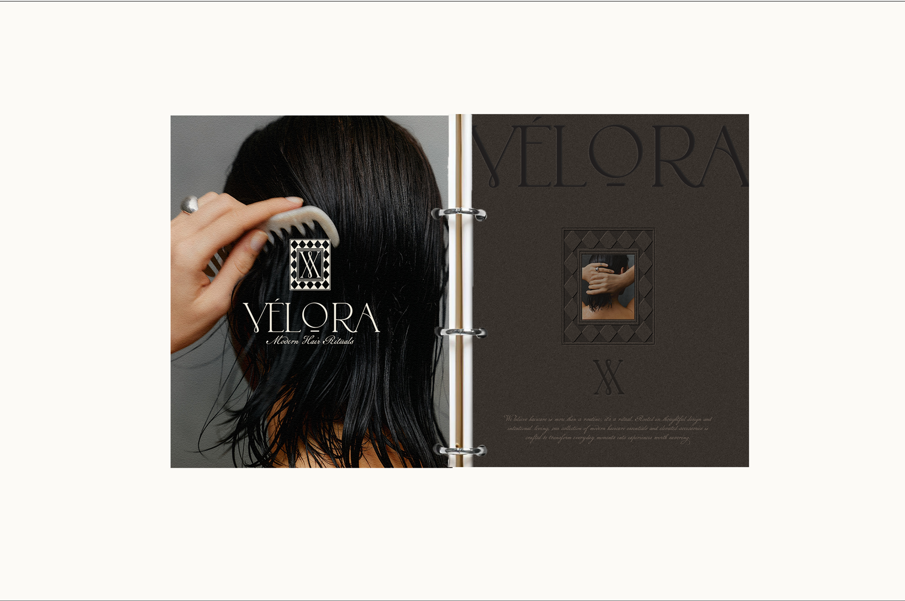
Color does more than decorate — it communicates. Learn how to build a palette that feels intentional, elevated, and unmistakably yours.
Colour is one of the most powerful tools in a brand identity — and one of the most frequently misunderstood. It is not about personal preference, and it is not about what looks nice in isolation. It is about what your colour palette communicates to the people you are trying to reach.
Start with feeling, not aesthetics
Before you open a colour tool or a mood board, ask yourself: how do you want people to feel when they encounter your brand? Calm and reassured? Energised and inspired? Luxurious and rarified? Warm and approachable?
Colour has a direct psychological impact. Deep, saturated tones read as bold and confident. Muted, earthy palettes feel grounded and considered. Pale, cool tones suggest precision and calm. Starting with the feeling you are aiming for gives you a filter for every decision that follows.
Understand what your industry expects — then decide where you stand
Every industry has visual conventions. Beauty brands gravitate toward certain tones. Finance leans on others. These conventions exist because they work — but they also create an opportunity.
You can choose to align with your industry palette and immediately feel familiar, or you can differentiate deliberately. Neither is wrong. What matters is that the choice is intentional and backed by an understanding of your audience.
Build for cohesion, not variety
The most common mistake in brand colour is trying to use too many. A palette with five to seven colours sounds comprehensive, but it often just creates noise. The strongest brand palettes are built around one or two anchor colours, with the remaining tones serving as supporting acts.
Every colour in your palette should have a clear role. Primary for dominance. Secondary for contrast or accent. Neutral for breathing room. When each colour has a job, the palette feels purposeful.
Test in context
Colours look different on screen than in print, different in large blocks than in small details, different against light backgrounds than dark ones. Before finalising a palette, test it in the actual contexts where it will live — your website, your email headers, your packaging if applicable.
What reads as sophisticated in a swatch can feel flat on a full-screen background. What feels too subtle in isolation can be exactly right at a smaller scale.
Document your palette properly
Once you have built a palette you believe in, document it with precision. Hex codes for digital, RGB for screen, CMYK for print, Pantone if you are working with physical materials. A beautiful colour system that only exists in your head — or in a single file without proper specifications — will drift over time. Documentation is what keeps it consistent.
Ready to build something that lasts?
ERA builds brand identities and custom websites for service and e-commerce businesses ready to step into their next era of growth.
Work With Us